City Digital Twin AR Zoom Lens - Feedback Report
Fontys Lectorate High Tech Embedded Systems Eindhoven
Eindhoven
| Date | 08-06-2023 |
|---|---|
| Version | 2.1.1 |
| Status | Finished Draft |
| Author | Skyler Vermeer |
Document History
Version
| Version | Date | Author | Amendments | Status |
|---|---|---|---|---|
| 0.1.0 | 07-02-2023 | Skyler Vermeer | Layout | Layout Draft |
| 0.2.0 | 16-02-2023 | Skyler Vermeer | Introduction added | Layout Draft |
| 1.0.0 | 30-03-2023 | Skyler Vermeer | Added Prep + Feedback Clickable Prototype | Draft |
| 2.0.0 | 24-05-2023 | Skyler Vermeer | Added Prep + Feedback High Fidelity prototype (xr event and it festival) + Conclusion | Finished Draft |
| 2.1.0 | 25-05-2023 | Skyler Vermeer | Formatting and spelling error fixes | Finished Draft |
| 2.1.1 | 08-06-2023 | Skyler Vermeer | Added 1.1, 1.2 etc | Finished Draft |
Communication
| Version | Date | To |
|---|---|---|
| 2.0.0 | 24-05-2023 | Simona Orzan |
| XXX | xxxx | xxxx |
Introduction
In this document, we will answer the question “How can the Augmented Reality application be improved upon?”.
The goal of this document is to get outsider feedback to improve our application.
To do this, we will test our POCs at various stages with different testing methods and different people and document the testing and feedback and improvements based on it. This way the parts that we can improve within our scope will be improved and the parts outside our scope will be noted down for advice.
Table of Contents
1. Clickable Prototype / Wireframe
Introduction
To validate that our designs make sense to the possible users as well as see in which ways they can be improved, we made a clickable prototype. However, the goal of this was not to validate the user behaviour but to ensure the designs and concepts of the application are clear. That is why it would be more of a ‘clickable wireframe’.
The designs in question are:
1.1 Preparation
Expo / Survey
On March 27th there was an interactive poster market where students could use the visitors to verify their concepts and projects. In preparation for this, we made a survey to test our clickable prototype.
The goal of our survey is to get an overview of our testers so we could relate them to our personas, see what their current knowledge of fine dust is, and get feedback on both the concept and designs.
The questions prepared in a printed survey were:
General
What is your age:
What is your gender:
What is your highest form of education:
Are you busy or do you have a lot of free time?: Busy |—————————————-| Free time
Do you stay in one place or move around a lot: Stationary |—————————————-| Moving
Domain
Do you know what fine dust is?:
Do you know why it is being monitored?:
Do you know what the main health concerns are?:
Concept
The A(I)R Zoom lens is an application meant to make fine dust more tangible, to make people aware it exists, is a problem, and how big of a problem it is at that moment for them.
Do you understand the concept?:
Would you use the application based on this concept?:
For what goal would you use this application? You are allowed to refer to the personas for examples:
Do you have any questions regarding the concept?:
Do you have any tips/feedback based on solely this concept?:
Design
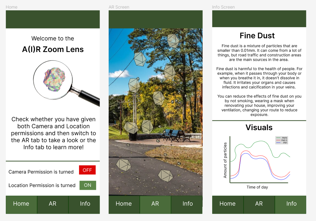
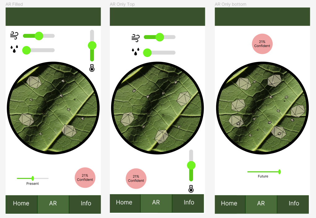
There is a clickable prototype available with designs for the application. You can click through the application to see what it might look like, and if you press the ‘AR’ Navigation button multiple times you can cycle through multiple different designs.
What is the first interesting thing you notice about the designs?:
What is the first point of annoyance about the designs?:
Please describe the AR design you prefer:
Do you have any feedback about the designs?
Additional Feedback:
Through other eyes
The goal of this was to validate our clickable wireframes through the eyes of someone else as they might see something we did not notice. In this case, we had similar aspects as the survey, except we focused on validating the concept and design instead of also testing the base knowledge of the testers and relating them to the personas.
For this, we explained the concept, walked them through the prototype to show the different designs for them to provide feedback on and allowed them to comment on it.
1.2 Feedback
Expo
Unfortunately, the poster market had a very limited amount of visitors, of which most were fellow students or teachers who visited other stands. After conferring with my stakeholder and colleagues we decided to ensure that we could validate the designs at least by talking to some Media Design students later that week.
Media Design Students
Group 1 - 3 Guys
The guys had some feedback. They also usually agreed with each other’s feedback, except for the selected tab not being clear. They also mentioned that they liked the concept and would like it on their own phone. Their feedback was the following:
General
- The selected tab is not clear (other group members recognized that there was a different colour for the selected tab)
- You should add icons to the navigation bar, so a house for the home button, some type of virtual reality icon for the AR tab etc.
Home
- The moving gif on the home page is nice
AR tab
- Make the sliders the same (alternatively, Figma has iOS sliders. We are not focusing on iOS). The difference in sliders between the environment variables and time sliders is confusing.
- Label the icons. It is not clear what each icon means right now.
- The colour scale for confidence is nice (it was not intuitive right now as it didn’t change, but they agreed with the plan after commenting on the colour of the confidence indicator)
- All the variables on one page is the preferred design but put all the variables together, preferably at the bottom. This makes it more ergonomic so the user doesn’t constantly have to adjust how they select the sliders.
- The zoom-in effect is nice (in the circle). It aids the concept.
Info tab
- Make the graph bigger, especially the legend. On pc it is already small, on a phone it is even smaller.
- Make the text bigger, it will be harder to read on the phone.
- Look at the Figma community and how they do graphs.
Group 2 - 6 Girls
The girls had some feedback and generally also mentioned that they agreed with previously made feedback. They also mentioned that they liked the concept and would like it on their own phone. Their feedback was the following.
General
- The title, A(I)R Zoom lens is nice
- They like the minimalistic simplicity of the application.
- The green theme is nice, it fits the sustainability concept
Home
- Add icons to the permissions, so you can remove the text.
- Add sliders to the permissions instead of the on/off buttons.
AR tab
- Make it more intuitive, for example confidence is not clear, but accuracy would be better. Make low confidence more prominent, as it is a bad thing so more prominent red. You could also just make the text red, so it would fit within the theme.
- They like the full-screen AR vision, but with the idea that you could zoom in on the areas by tapping on them and then getting the zoomed-in screen. (This functionality is not possible seeing as we work using GPS coordinates and we can only ever be as accurate as those GPS coordinates)
- Give the user more autonomy by allowing them to edit which sliders they want to see.
- Move the sliders down to make it easier for the user to adjust the sliders.
- You can barely see the smaller particles.
Info tab
- Make the text bigger, it is hard to read on a phone.
- Make bullet points for info, so it is easier to read.
- Make the visual graph more interactive, for example if you select PM10, you get more information about that particle size.
Conclusion
Based on this, we can see that the concept itself is good and liked, but there are some adjustments to be made. The main repeating ones are to make the text larger, add icons to text or replace text with icons and add labels to existing icons and move the sliders to the bottom.
Based on that we can make some new designs:
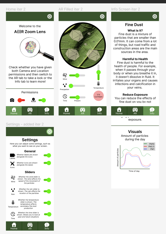
In this case, the info screen has a scroll functionality. The text was made bigger, a settings screen was added, icons and labels were added, and the permissions were replaced with icons and sliders. The sliders were all moved to the bottom of the page.
The girls liked the full-screen better, but the functionality they would’ve liked to see, with a zoom-in on a location on a tap is not possible as we get the data in the location scope, so we cannot be more specific than a GPS coordinate. The confidence indicator needs some additional testing as to what the best design for it is.
2. High-Fidelity Prototype
Introduction
To validate the base concept that the research is based on, and to see what needs to be improved in case the project is continued, we made a high-fidelity prototype. The goal is to see how much the user already comprehends the project, what they think of the project and see the limitations of the current project.
2.1 Preparation
Augmented Reality Expo
On May 12th Fontys held the XR event where the A(I)R Zoom Lens had a stand. For this, we knew that we would need to be able to show the AR component, the data was less relevant. That is why we focused on developing that aspect. Seeing as we didn’t know how much we would be able to accomplish, there wasn’t anything such as a survey prepared. We simply would see what comments or questions we would get and work from there.
At the time of the XR Event, the prototype looked like this: 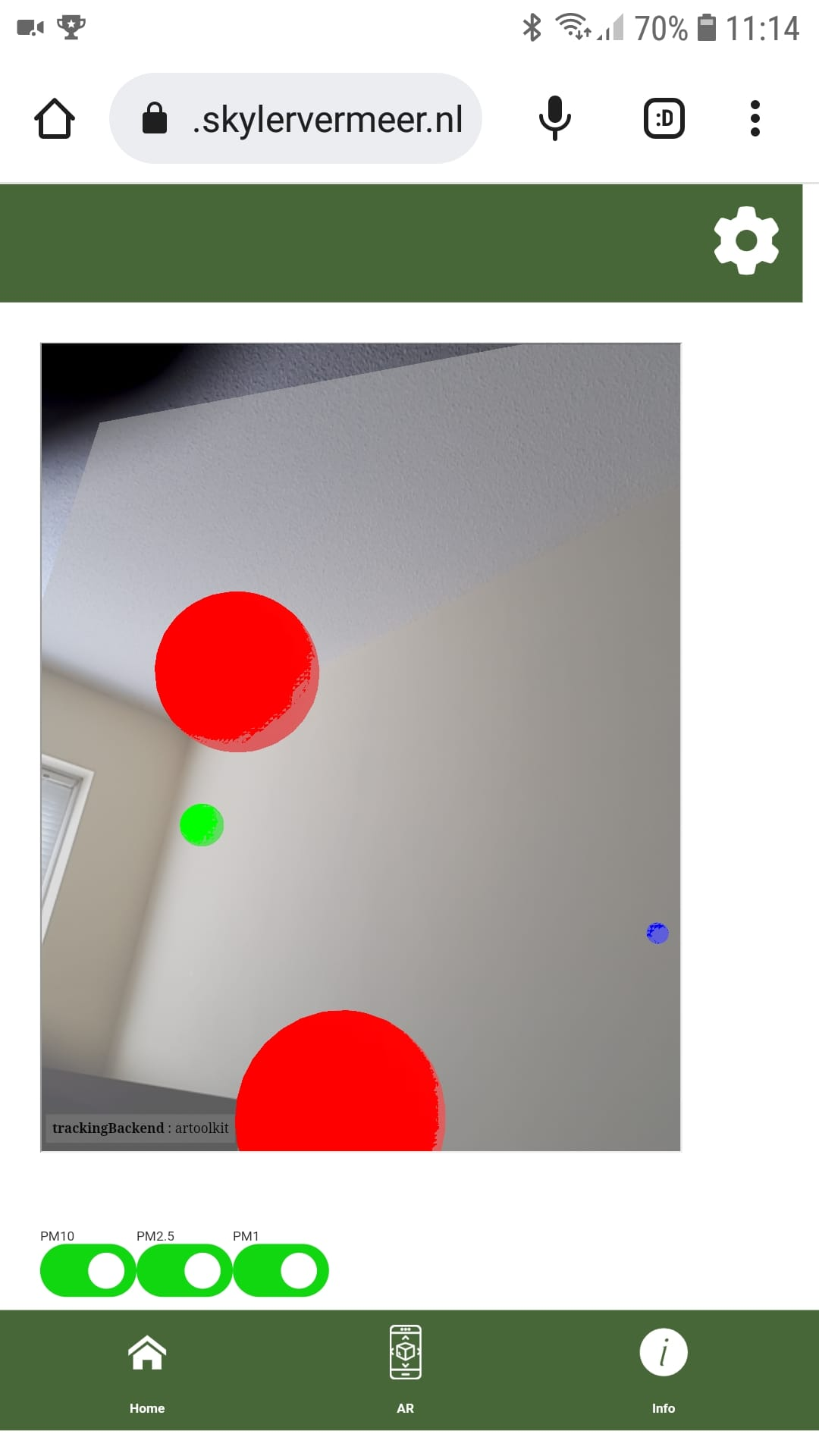
It had AR functionality, displaying real-time data for a static location. The real-time data was the concentration that the API provides. There were 3 models, spheres in red, green and blue for PM10, PM2.5 and PM1 that were sized to scale.
The application was publicly accessible on cdt.skylervermeer.nl but nobody used that opportunity during the event. We also brought the AR-accessible phone that we’ve been using for this project, which also showed the website.
Artificial Intelligence Expo
On May 24th Fontys held the IT Festival, including an AI expo to which the A(I)R Zoom Lens was invited. For this, the Artificial Intelligence component and the data were the main focus of the expo. The designs and such were less of a priority. This meant that for this expo, we focused on being able to show the past, present and future of the data.
During the testing of this prototype, we noticed that the request for the latest location took quite a long time, limiting the user experience. That is why for the expo we decided to use the closest location to the festival statically.
At the time of the AI Expo, the prototype looked like this: 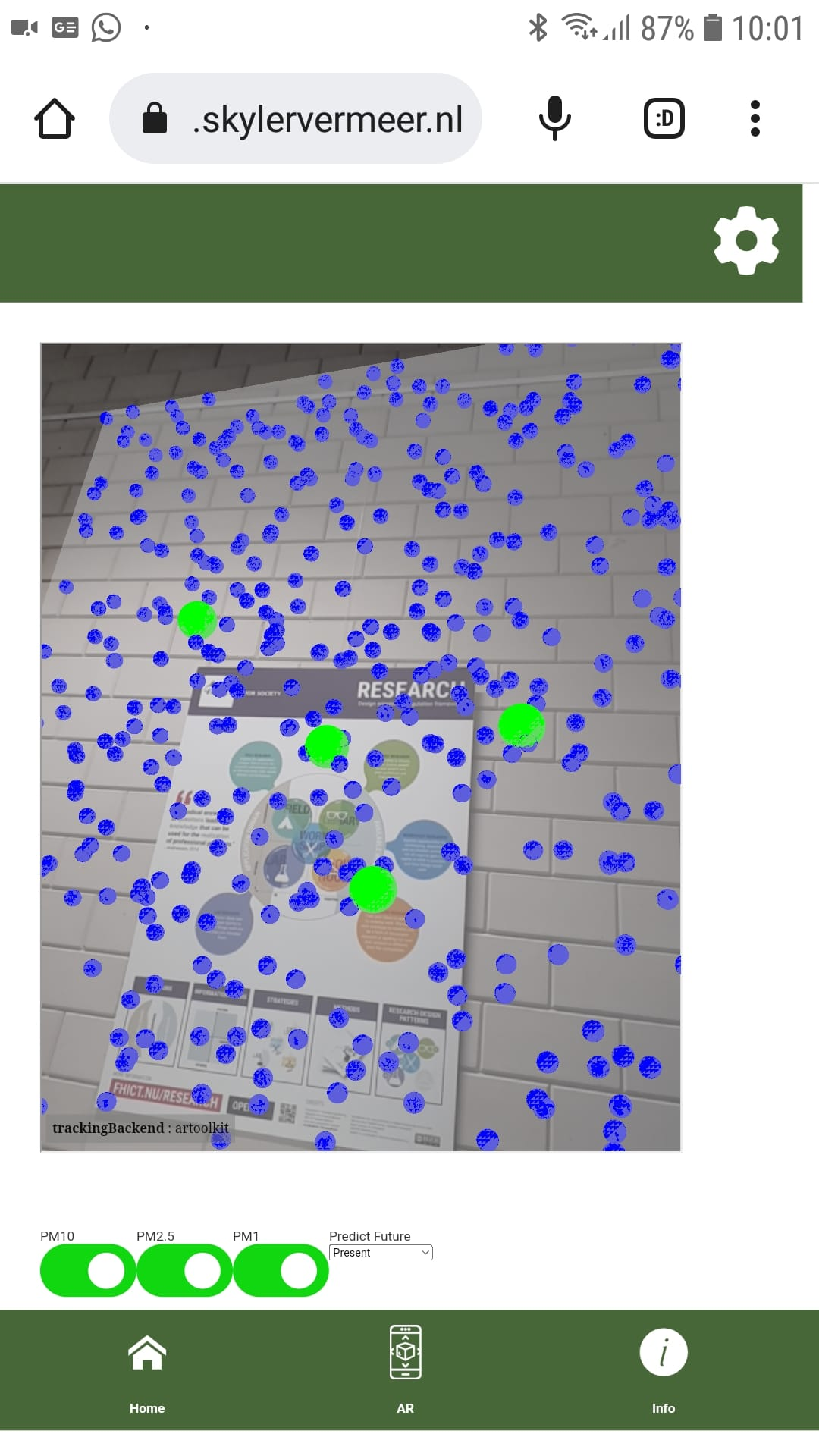
The application was publicly accessible on cdt.skylervermeer.nl. One person took a picture to be able to look at it when they got home, but nobody used this functionality during the expo. We also brought the AR-accessible phone that we’ve been using for this project, that also showed the website.
The functionalities of the application were a similar visualization as the XR event, except instead of concentration, the calculation was integrated so it displayed the number of particles per dm3. It also added the functionality to be able to look 6 hours into the past and the future. With the integration of the model, the data also gets updated automatically for the location that the user is using. This includes historical weather data and a weather forecast for the coming 6 hours.
2.2 Feedback
XR Event
During the XR event, there were a limited amount of people. Approximately 5 people or duos came to the stand. Overall they liked the concept, and it was compared to buienradar without prompting 3 times.
Questions and (General) Answers
- What is it, and why should I be worried about it?
- Provided a general description of what fine dust is, and the impact on health it has
- Is this aimed at providing insight/awareness, or is this a solution?
- It is currently providing insight, it is by no means a solution but it could be used to inform users on how to change their behaviour based on it. This is not possible within the current scope but will be one of the advised improvements if the project gets continued.
- Does the application work better inside or outside?
- It currently uses the data from the ILM2 network from TNO. These are sensors scattered throughout the municipality of Eindhoven. However, the application is scalable, so it is possible to expand it in such a way that you can also add your own sensors, for example in your own building. In this case, inside would provide better results as it is a closed environment where weather factors have less of an effect.
- Should people just not go outside anymore then?
- Actually, inside is worse, as outside it has more places to go and can be moved by the wind. However, it is something that has always been there, but if people don’t adjust their behaviour, both inside and outside, that can have an impact on their health.
- Is it real or a simulation?
- It is a simulation based on real-time, or predicted, data of the closest sensor to the user. So the visualization is a simulation but the data is real, though maybe not as accurate if you are far away from the sensor and/or inside a building.
Use Cases
- Checking long-term locations. For example, is the air quality a beneficial or a negative impact in the decision to live in this area.
Exclamations
- Nice, impactful project
- It’s almost something you would put in the newspaper
IT Festival
During the IT festival, there was quite a steady flow of people coming by the stand. It officially started at 14.00 but around 13.30 people were already coming in. It lasted until 16.00. During this time at the longest, there were 5-10 minutes between people visiting the stand. They were all positive about the concept.
Questions and (General) Answers
- What can we do about it
- General explanation about the natural defences of the body and how you adjust your behaviour to minimize your exposure.
- Do you verify whether what is currently being measured is correct?
- The data is measured by TNO and informs the people in power. They take care to ensure the measurements are as close as possible and that the measurements are up to date.
- Would you like to know if someone places a sensor themselves?
- Currently, we are only using the TNO sensor network, but we hope to expand to using for example the sensor community in the future. If the application is a bit further developed we would love to know it if we can use measurements from more sensors to be even more accurate but right now we are focusing on developing the application instead of expanding it.
- Where are you currently getting data from?
- We are currently getting data from the TNO API and from historical KNMI data and Weather API (historical and forecast). In the future, we hope to expand this with communities such as the sensor community so we can get data that might be less accurate due to it using a cheaper sensor but is closer to the user.
- Why is the i between brackets in A(I)R Zoom Lens?
- The project is a combination between AI, AR and AIR quality. The brackets mean exclude the i to get AR.
- Can you make it even more specific, with the type of particle instead of just the size?
- There is research on what types of particles are currently in Eindhoven, but that data isn’t available in real-time as widespread as the concentrations are. So currently that isn’t possible.
- When can I use it?
- The application I am currently showing is already publicly available on cdt.skylervermeer.nl. However, before it will be shared with the public, it needs a bit more development to improve the user experience. It currently needs quite a bit of explanation to understand what people are seeing, so to make it so people don’t just open it once, don’t understand it and leave it, I will be writing an advice report so someone can work on that when continuing the project.
- What is being focused on (the research question specifies city problem)
- We are focusing on fine dust particles, after analysing several city problems in Eindhoven and their possibilities for AR and AI. It can be expanded in the future but we aren’t planning for that currently.
- How much data do you have?
- We have approximately 50 locations in the municipality of Eindhoven measuring every 10 minutes since somewhere in 2021.Combined this gives approximately 5 million entries. We are training per location, using the mean of each hour. So approximately 100.000 per location and then approximately 17.000 entries for modelling. But it is also constantly growing and using that new data for predictions.
- How do you determine how accurate the prediction is?
- Seeing as the data is updated regularly, we can simply remove the last 6 hours from the data, train the model and compare the prediction to the actual data. This gives an MAE of 1.553 and an RMSE of 1.837 for the PM1. We cannot be completely accurate as between the sensor and 1 meter from it there is already a difference. But by using the closest location to the user we can predict and visualize it close enough to approximate it to give people an indication of the situation. It is good enough to allow people to make informed decisions and to create awareness.
- Are the dots the sensors / does the camera measure the fine dust?
- The fine dust is measured by sensors around Eindhoven, and the AR shows a simulation of the data collected by the closest sensor.
- What is the use practically except for for example when you are going to walk outside?
- There are several uses. On one hand, the goal is to create awareness. The more people know about it, the more they can keep it in mind. By making it visual people can understand it better. People can adjust their behaviour, for example by checking when the best time is to go outside, but they can also in general check what the air quality is. For example, some people who noticed health concerns after trees were cut down around their homes. A sensor was placed to validate their concerns. Using this you can visually see whether there is a strong difference in air quality between multiple moments.
- Does height make a difference in the visualization?
- We can’t be that accurate that we can for example know the height of the particle. The visualization is just randomly showing the amount as it was measured or predicted per 1 dm^3. We might change the positioning of the models in the future, for example by making them move or placing them around the user.
- So this is meant to be used outside?
- The best results are currently for outside, as the ILM2 sensors are. However, in the future you might be able to add your own sensors, which means that inside closer to the sensor is also possible.
Exclamations / Statements
- Interesting
- Cool
- We are looking into it, but nobody in my environment has placed their own sensor, or at least not publicly, so we might be buying our own sensor.
- I think I’m going to look into placing my own sensor.
- Looks kind of nice
- When can I use it!
- I understand it much better than just a bunch of numbers
- Good that you are already thinking about how the app can be expanded and things such as integrated with the sensor community and making the app scalable.
- I have COPD so I am always looking for ways to see how I can adjust my behaviour.
- This is pretty advanced - Frens Vonken
Use Cases
- You could also have some sort of heat map of like right here is a ‘green zone’, where it is okay but in the back there it is red.
- (This is not currently possible, but the combination of Location-based AR instead of relative to the user could be used if you place sensors in your own close proximity.)
- Software S3 is currently making a type of Google Maps that minimizes fine dust exposure, but it isn’t clear what the effect is right now. This visualization would make it more tangible what the difference is when walking through the forest versus next to a construction site.
Conclusion
Based on this, we can see that the concept itself is good and liked, though some things need to be explained better or improved. Changes that we can still make during this iteration of the project are minimal, however, we can note down some pieces of advice for future project members.
Things that need to be better explained are:
- What people are seeing and why it is good or bad.
- The application is meant for insight and/or how can people adjust their behaviour based on the application.
- Where the application is best used.
Adjustments:
- Add the ability for more sources, such as through the sensor community. This allows people to ‘personalise’ it because they can apply it to their own environment.
- A way for users to see how ‘accurate’ the visualization is. This is already in the designs but should be a priority in other iterations.
Conclusion
Based on this feedback we were able to improve our designs and construct advice on how to continue with the project. We were also able to validate the positive attitude the public has towards the project and their interest in the topic and concept.